Our scale—our size in proportion to our environment—is something most of us don’t think about. After we’re grown, our size is a given; such a constant factor that we don’t notice how it underpins a sense of self, or wonder why that sense of self only emerges when a body is at a certain size. Perhaps, in a biology course, we consider briefly that we started at microscopic scale. Maybe, in a walk by the ocean, we get a taste of self as a tiny impulse within an immense life force. But mostly the span in which we know ourselves is the familiar “middle ground,” constructed by the distances our adult bodies can see, walk, and reach.

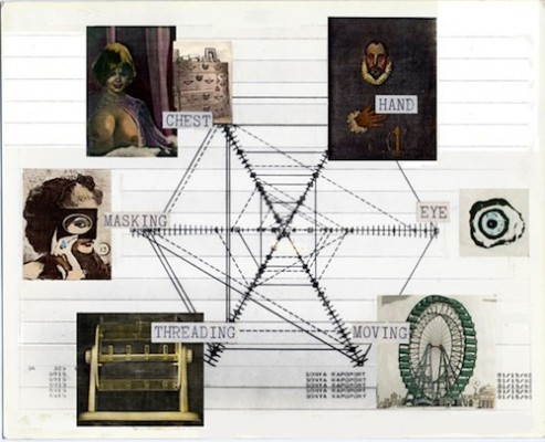
Sonya Rapoport, Objects on My Dresser Phase 4: Exhibition in Print, 1981
Not surprisingly, most art assumes human scale. I might never have questioned this habit were it not for an exception, the work of Sonya Rapoport. Rapoport does make things that can be seen, so they are literally within our size range. But in her prints, installations, and webworks, she gives us a big structure peppered with hundreds of details, without much intermediate organization. Formally she turns the human-centered universe inside out, surrounding a relative void in the middle with a buzz of activity at the “micro” and “macro” scales. It’s as if when you were looking at a person you could see that they were six foot five and you could see their nose hairs, but nothing in between would come into focus. It is odd, disorienting, and subtle. Despite long acquaintance iwth her work, it has taken me nearly twenty years to puzzle out this key feature, which I could sense but not articulate.
It may have taken so long because distinctive properties of scale disappear in the partial, shrunken forms of reproduction and opportunities to see Rapoport’s work were rare. A conceptual, scientifically-oriented artist who is now in her early 80s, Rapoport worked for most of her life in relative obscurity. That is beginning to change; within the past year she has had a book, Pairings of Polarities, published on her work (I contributed an essay to it), and two substantial exhibitions, at the Kala Institute and the Mills Museum. It wasn’t until I saw her decades of work displayed together that I could grasp their patterns, although I first visited one of her installations—in rather bizarre surroundings—in 1991.

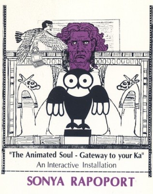
Invitation to Sonya Rapoport’s interactive installation The Animated Soul: Gateway to Your Ka, 1991
That first encounter with Rapoport’s work was at the Ghia Gallery, a now-defunct venue that specialized, in the words of critic Tessa diCarlo, “in things to put dead people in.” Coffins. Urns. Chrome rhino heads with hollows for ashes in their horns. Rapoport’s computer-assisted interactive installation, The Animated Soul: Gateway to Your Ka (1991), made use of the gallery’s stock of coffins, integrating them into the installation as the end point of a “soul journey” based on the Egyptian Book of the Dead. One’s “spirit guide” was a HyperCard program which, after viewers responded to a few questions, directed their paths through various stations of life to their coffins. Despite the content, the exhibition had an ebullient vibe. Viewers were primed to respond to symbols such as the ankh and the ibis by the “Tutmania” that infected San Francisco that year in the wake of the DeYoung Museum’s “Treasures of Tutankhamen” exhibition. Rapoport’s technological Egyptiana (and, perhaps, her audience’s innocence of Said’s critique of orientalism) made the ancient icons the Bay Area’s own.
This period video, The Animated Soul: Gateway to Your Ka, documents Rapoport’s installation. There are two short stretches of black screen between the titles and the footage…scroll forward to :24 or be patient. from Meredith Tromble on Vimeo.
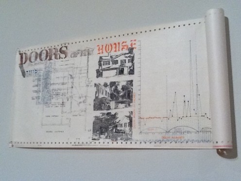
Nothing could be more human-scaled than a coffin, but in retrospect the way that Rapoport massed details—hundreds of small icons and texts—into a bridge skimming over ordinary life to eternity is of a piece with her other work. Doors of My House (1978), for example, a group of scroll-like prints on recycled dot matrix printer paper, framed the door of the exhibition at the Mills Museum. The prints obsessively tabulated features of the doors in Rapoport’s home, such as their vintage (the highest percentage of 1911 doors was on Floor 3), their locking devices (e.g. “latch with key,” “latch without key”), and the elegance of their handles (the “elegance percentage” of the door handles decreased with the floor levels). Hundreds of facts about the doors were charted and illustrated with stencils and Xerox transfers. Despite the abundance of information and the personal subject matter, there were almost no hints of personal experience; no memories of stepping through the doors for the first time or slamming them in anger. We learn nothing about Rapoport and a lot about minute variations on the grand, Platonic concept “door;” like an archaeologist, she measures and describes material facts.

Sonya Rapoport, detail from Doors of My House, 1978
Prisma color, stamps, and Xerox transfer on continuous feed computer paper
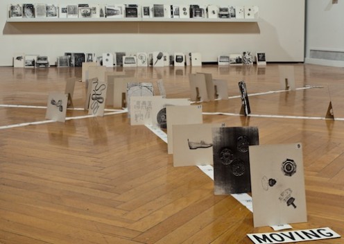
The end result is more diagram than picture. By this I mean that one is meant to inspect the work and parse it, not apprehend it as a presence with emotional unity. Shared Dynamics (1981), one of the participatory installations Rapoport called “netwebs” (predating the digital turn and World Wide Web) includes images that Rapoport associates with her mother. It was made at the time she was grieving her parent’s death. But we know this only from the wall text that accompanies the piece; the work itself is a collection of images that viewers can position along several axes of meaning. The relationships between the images are always changing, so they never tell the same story. Instead, they give viewers a chance to think, to notice their own associations and organizing stories. Rapoport controls the details and the big shape of the piece, but leaves a void in the middle ground, the place where a particular personality organizes the images into particular meanings.

Sonya Rapoport, Shared Dynamics, 1981/2012, mixed media
Finally “seeing” the void in Rapoport’s work brought to mind other artists, including Jess and Patricia Olynyk, who favor the extremes of scale. Struggling to see the work, I became more aware of the strategies—including comparisons with other art—that I’ve been taught to use for looking. I”ll come back to these strategies, and the patterns of thinking we bring to exhibitions, soon. The next post covers another Pacific Standard Time exhibition: State of Mind, New California Art, 1970, delving into a historical moment when artists began pushing their audiences to break their habits of looking.
Spaces of Life: The Art of Sonya Rapoport, curated by Terri Cohn and Anuradha Vikram, was on view at the Mills Museum in Oakland, California January 18 – March 11, 2012.
